Elements & Templates
Inkweld's worldbuilding system is built around elements—structured entries that you create to represent anything in your story world. Characters, locations, factions, items, creatures, magic systems—they're all elements, and you define their structure using templates.
New projects start with a set of built-in templates covering 29 common element types. See Element Types for the full list — or clone and customize them, or design your own from scratch.
What Are Elements?
Elements are worldbuilding entries with structured data. Unlike free-form documents, elements have:
- Fields organized into tabs
- Consistent structure defined by a template
- Relationships to other elements
- Backlinks showing where they're referenced
Think of elements as database entries for your story world, but with the flexibility to define exactly what data you want to track.
What Are Templates?
Templates define the structure of elements:
- What fields to capture (name, description, stats, etc.)
- How to organize fields into tabs
- What field types to use (text, selection, number, etc.)
Every element uses a template. You can create as many templates as your story needs.
Quick Start
Creating an Element
- Right-click on a folder in your project tree
- Select "New Worldbuilding Entry"
- Choose a template (or create a new one)
- Enter the element's name
- Click Create
The element opens with structured fields to fill in.
Creating a Template
There are two ways to create a new template:
Option 1: Create from Scratch
- Open your project
- Go to Project Settings → Element Templates
- Click the "Create Template" button
- The template editor opens with a blank starter template
- Define your fields and tabs
- Changes save automatically as you go

Option 2: Clone an Existing Template
If you want to start from an existing template (like the built-in Character or Location templates):
- Go to Project Settings → Element Templates
- Find the template you want to base yours on
- Click the three-dot menu (⋮) on that template's card
- Select "Clone"
- A copy is created that you can rename and customize
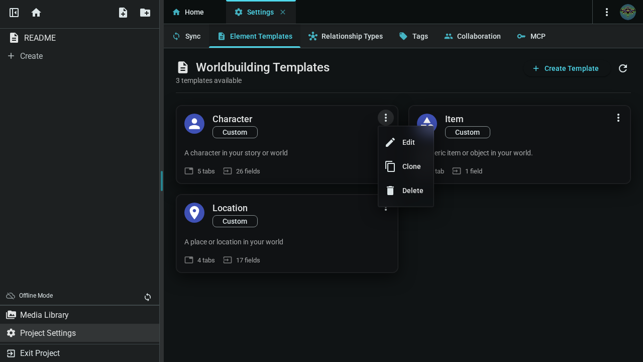
Cloning is great when you want to create a variation of an existing template. For completely new element types, use Create Template.
Understanding Templates
The Templates Tab
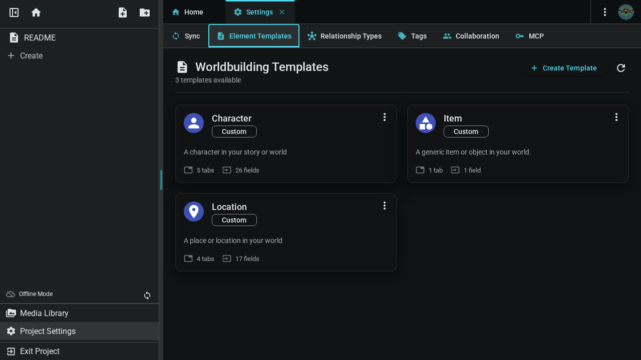
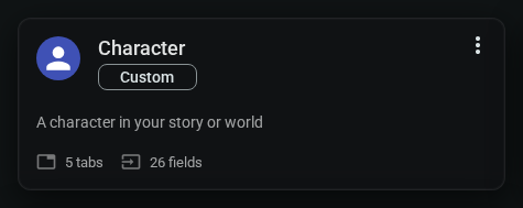
The Element Templates tab in Project Settings shows all your templates at a glance. Each template card displays:
- Name and icon (visual identifier)
- Type badge: Built-in (ships with Inkweld) or Custom (your creations)
- Action menu (⋮) for editing, cloning, or deleting
Template Components
A template consists of:
| Component | Description |
|---|---|
| Name | What this element type is called (e.g., "Faction") |
| Icon | Visual identifier in the project tree |
| Tabs | Sections to organize fields |
| Fields | Individual data points to capture |
Field Types
| Type | Use For | Example |
|---|---|---|
| Short Text | Names, titles, brief info | "Elena Blackwood" |
| Long Text | Plain text descriptions | Backstory summary |
| Selection | Pick from options | "Faction Type: Guild" |
| Multi-Select | Pick multiple options | "Abilities: Flight, Magic" |
| Number | Numeric values | "Level: 5" |
| Date | Timeline entries | "Founded: 1242" |
| Toggle | Yes/No values | "Active: ✓" |
| Array | A list of short tags | Tags, features |
The Template Editor
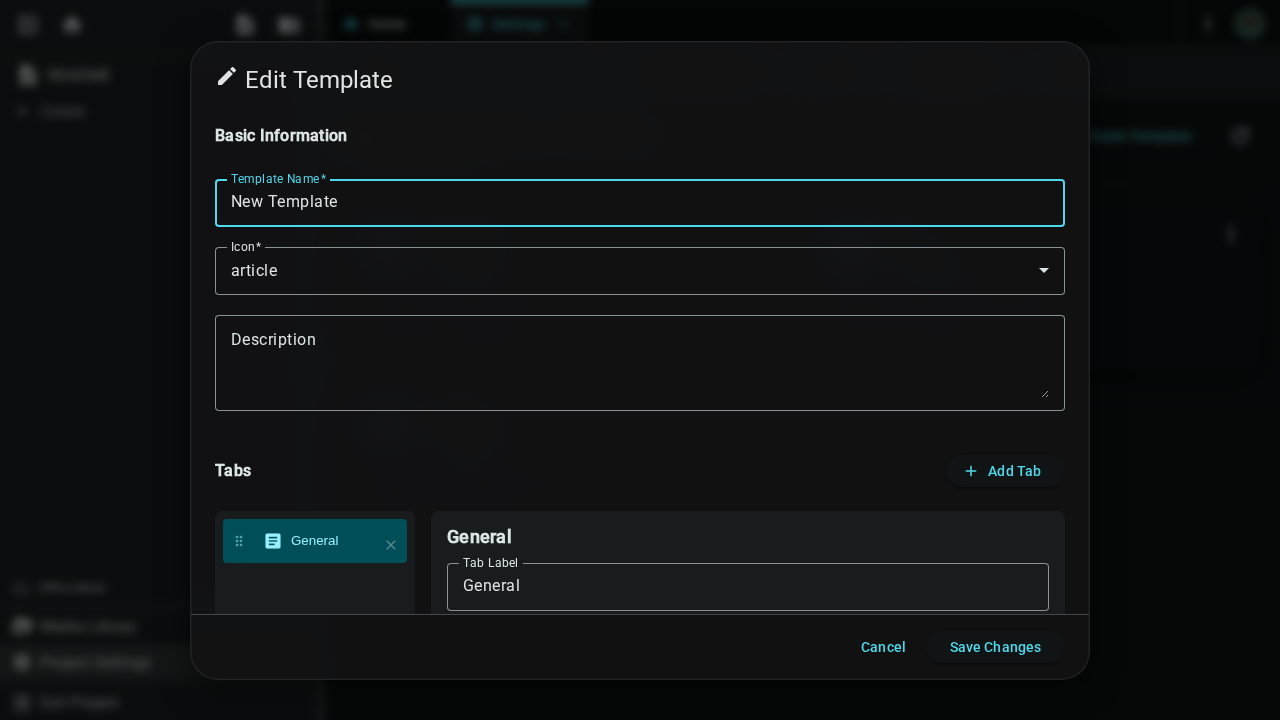
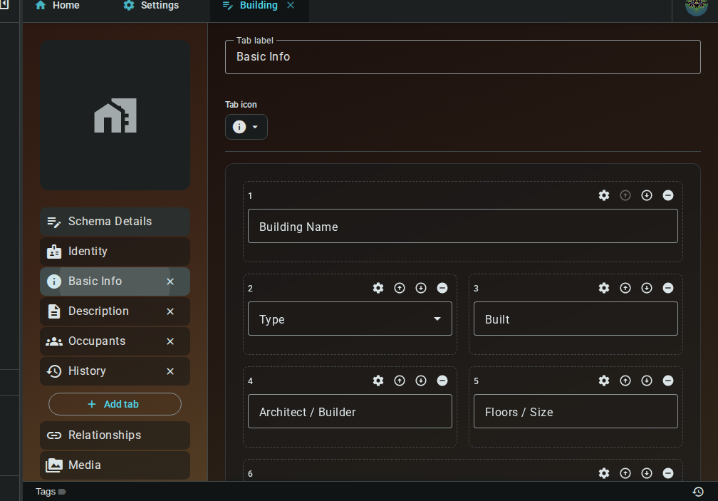
When you create or edit a template, the Template Editor opens as a live, interactive preview of the template. It's not a separate form — you edit the template directly in the same editor you use to fill in elements, so you can see exactly how the fields will look as you build them.
The editor is organised into sections down the left-hand navigation (or as stacked panels on narrow screens):
- Schema Details (the top section) — the template's name, icon, and description
- Tabs — one section per tab, where you manage that tab's fields
- Identity, Relationships, Media, Styling — the fixed sections every element has
In each tab you can:
- Add fields with the "Add field" button
- Edit a field in a settings dialog — click the field's edit control (⚙) to change its label, key, type, placeholder, options, required state, column span, and more
- Remove or reorder fields with the controls on each field
- Rename the tab and pick its icon from a picker dialog at the top of the tab
- Add or remove tabs from the navigation
Column span controls how wide a field is across the tab's 12-column grid — pick a span in the field settings dialog, and the preview reflects it.
Under Schema Details you set the template's name, icon, and description. Under Styling you can set a default appearance (backgrounds) and default image that new elements of this type get.
Changes save automatically as you edit — there's no separate Save step. You can also create and restore template snapshots from the snapshot button to protect your work while designing.
Template Examples
Here are examples of templates you might create. Remember, these are just suggestions—design templates that fit your story's needs.
Character Template
Track people in your story:
Tab: Basic
- Name (short text)
- Aliases (short text)
- Age (short text)
- Role (selection: Protagonist, Antagonist, Supporting)
Tab: Description
- Appearance (rich text)
- Personality (rich text)
- Motivations (long text)
Tab: Background
- Backstory (rich text)
- Skills (long text)
- Relationships (rich text with @mentions)
Location Template
Track places in your world:
Tab: Overview
- Name (short text)
- Type (selection: City, Town, Wilderness, Building)
- Region (short text)
Tab: Details
- Description (rich text)
- History (rich text)
- Notable Features (long text)
Faction Template
Track organizations and groups:
Tab: Overview
- Name (short text)
- Type (selection: Guild, Government, Religious, Criminal)
- Motto (short text)
Tab: Structure
- Leadership (rich text with @mentions)
- Hierarchy (rich text)
- Membership Size (number)
Tab: Goals
- Objectives (rich text)
- Allies (rich text with @mentions)
- Enemies (rich text with @mentions)
Item Template
Track objects and artifacts:
Tab: Basic
- Name (short text)
- Type (selection: Weapon, Armor, Tool, Artifact)
- Rarity (selection: Common, Rare, Legendary)
Tab: Properties
- Appearance (rich text)
- Magical Effects (rich text)
- Limitations (long text)
Tab: History
- Creation (rich text)
- Notable Owners (rich text with @mentions)
Managing Templates
Editing Templates
- Go to Project Settings → Element Templates
- Click the three-dot menu (⋮) on the template card
- Select "Edit" to open the Template Editor
- Add, remove, or reorder fields within each tab
- Changes save automatically — just close the editor when you're done
Deleting a field removes that data from all existing elements using this template.
Cloning Templates
To create a variation of an existing template:
- Find the template in the Element Templates tab
- Click the three-dot menu (⋮)
- Select "Clone"
- A copy is created with "(Copy)" appended to the name
- Edit the cloned template to customize it
Deleting Templates
- Click the three-dot menu (⋮) on the template card
- Select "Delete"
- Confirm the deletion
Deleting a template does not delete elements that use it, but those elements will lose their structured data and become orphaned.
Organizing Fields
- Reorder fields within a tab using the up/down arrows on each field
Working with Elements
Where to Store Elements
Organize elements however makes sense for your project:
- By type: People/, Places/, Factions/
- By story section: Act 1/, Act 2/
- By relationship: The Kingdom/, The Rebellion/
Connecting Elements
Elements become powerful when connected:
- @mentions: Reference elements in prose with
@ElementName - Relationships: Define semantic connections (parent, ally, located-in)
- Backlinks: See everywhere an element is referenced
See Element References and Relationships for details.
The Worldbuilding Editor
When you open an element, the worldbuilding editor provides a structured workspace for editing its data. The editor adapts its layout based on your screen size.
Desktop Layout (Sidenav)
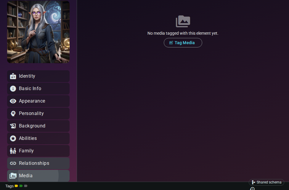
On screens wider than 760px, the editor uses a sidenav layout with a navigation rail on the left and a content area on the right.
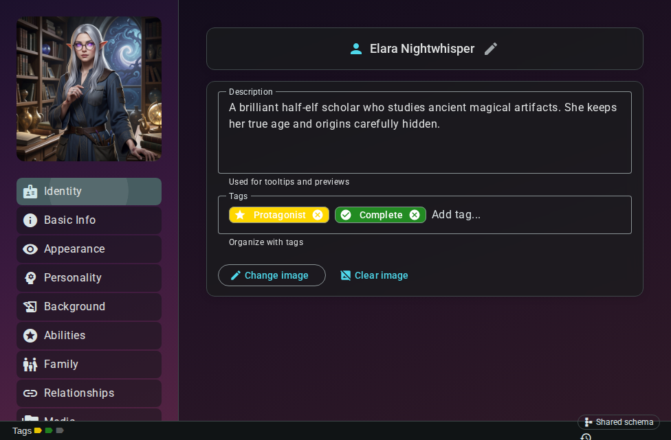
| Area | Purpose |
|---|---|
| Sidenav (left) | Navigation rail with section links and element thumbnail |
| Content (right) | The active section's fields and panels |
| Status bar (bottom) | Tags, document snapshots, and sync status |
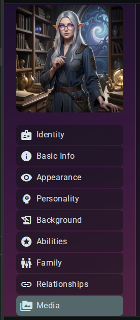
The sidenav shows:
- Element thumbnail — click to view the full-size identity image
- Identity — name, description, and image
- Schema tabs — one entry per tab defined in the template (e.g., Basic Info, Appearance)
- Relationships — connections and backlinks
- Media — images and files tagged to this element
Identity Panel
The Identity section holds the element's core identity:
- Name — displayed at the top (read-only; use the rename button to change it)
- Image — upload, crop, or generate an AI image for the element
- Description — a free-text summary of the element
- Tags — visual labels for organizing and filtering
Custom Backgrounds
The Identity tab includes an Appearance panel that lets you give the editor's two regions — the left-hand menu (sidenav) and the right-hand content area — their own background. This is a per-element setting, so each character, location, or item can have a distinct look.
For each region you can:
- Enable the custom background with the toggle.
- Choose a type: solid colour, gradient, or an image from your media library.
- Choose a theme mode:
- Auto — a single value that the editor adjusts for the active light/dark theme (images are automatically brightened or darkened so overlaid text stays readable).
- Manual — separate values for the light theme and the dark theme.
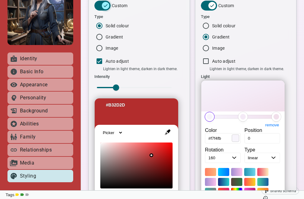
A solid colour applied to the left-hand menu.
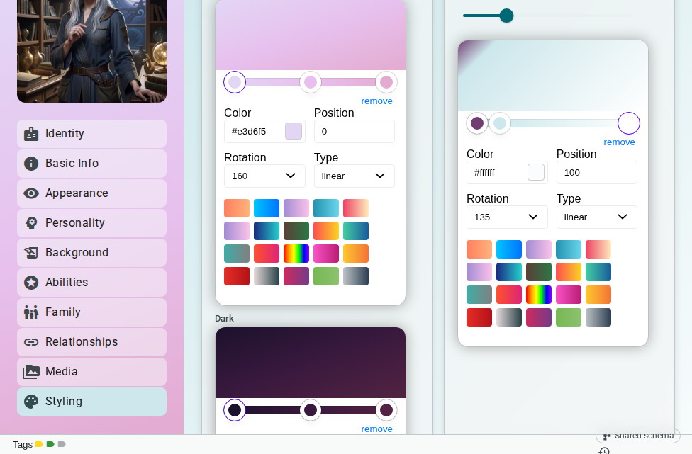
A gradient applied to the content area.
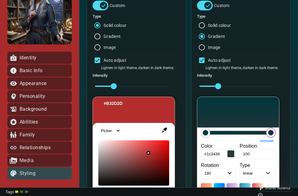
Both regions use custom backgrounds in dark mode.
Backgrounds are stored with the element and sync to collaborators in real time, like the rest of the identity data.
Schema Tab Fields
Each template tab renders its fields as a form. Field types include text inputs, textareas, selects, multi-selects, numbers, dates, checkboxes, and arrays.
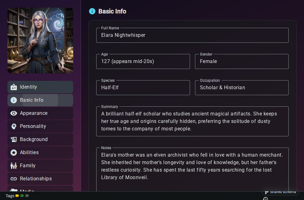
Fields are laid out in a responsive grid. Each field's span (set in the template editor) controls how many columns it occupies — a span of 12 is full-width, 6 is half-width.
Relationships Section
The Relationships section shows all connections for the element — both outgoing relationships you've created and incoming backlinks from documents and other elements.
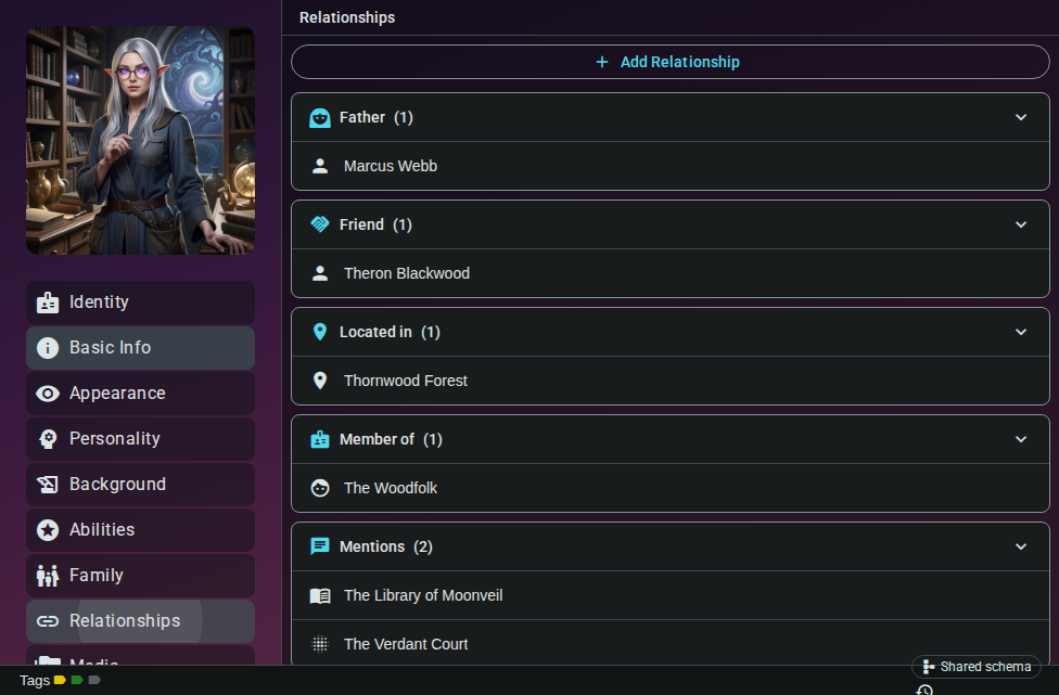
See Relationships for details on creating and managing connections.
Media Panel
The Media panel lists all media items tagged to this element. Add images from your media library or remove tags you no longer need.
Status Bar
The status bar at the bottom of the editor shows:
| Control | Purpose |
|---|---|
| Tags | View and manage element tags (click to open the tag editor) |
| Snapshots | Open the document snapshots dialog to save or restore versions |
| Sync indicator | Shows the real-time sync state (synced, syncing, or offline) |

Mobile Layout (Accordion)
On screens narrower than 760px, the sidenav is replaced with an accordion layout. All sections — Identity & Details, schema tabs, Relationships, and Media — are rendered as collapsible panels stacked vertically.
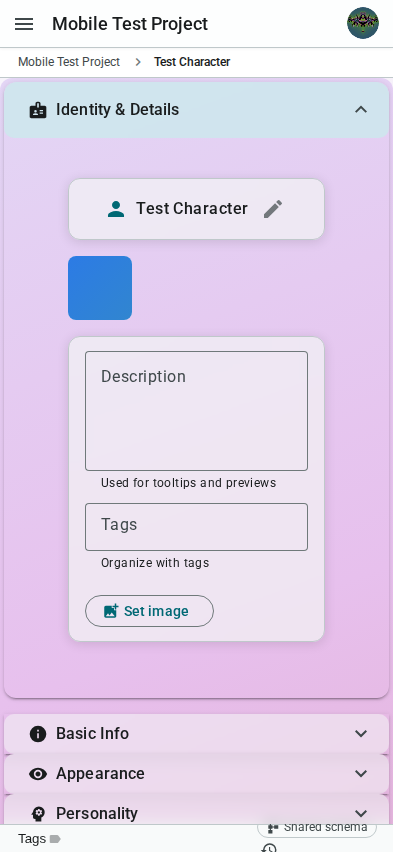
The Identity & Details panel is expanded by default. Tap any panel header to expand or collapse it. The accordion layout provides the same editing capabilities as the desktop sidenav, optimized for touch interaction.
Next: Element Types - Explore the 29 built-in element types and what each one is for.