Relationship Charts
Relationship charts let you visualize the connections between your story elements as an interactive graph. See how characters relate to each other, which locations connect, and how your story world fits together at a glance.
Creating a Chart
- Right-click in the project tree sidebar (or use the + button)
- Select New Relationship Chart
- Give it a name (e.g., "Character Web", "Family Tree", "Faction Map")
The new chart appears in the project tree alongside your documents and elements.
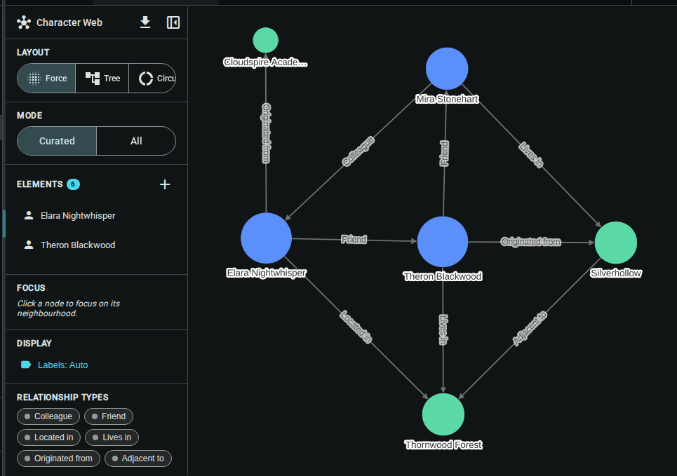
Display Modes
Charts support two population modes, configurable in the sidebar:
All Mode
Shows every element in your project that has at least one relationship. This is great for getting an overview of your entire story world.
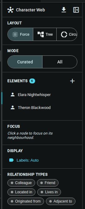
Curated Mode
Lets you hand-pick which elements appear on the chart. Use this to build focused visualizations like:
- Family trees — select only characters related by familial bonds
- Faction maps — select faction members and their allegiances
- Location networks — map out spatial relationships between places
To add elements in curated mode, click the Add button (➕) in the Elements section of the sidebar and select the elements you want to include.
The Sidebar
The sidebar contains all chart configuration options. Collapse it with the close button to give the graph more space, and expand it again with the panel button on the left edge.
Layout
Choose how nodes are arranged:
| Layout | Icon | Best For |
|---|---|---|
| Force | Scatter | Organic graphs where clusters form naturally |
| Tree | Account Tree | Hierarchical relationships (org charts, family trees) |
| Circular | Ring | Evenly-spaced arrangements, good for small groups |
| Grid | Grid View | Dense graphs, comparing many elements |
| Rings | Target | Centrality-based, most connected nodes at center |
Mode
Switch between Curated and All population modes (described above).
Elements (Curated Mode)
When in curated mode, this section lists the elements currently on the chart. You can:
- Add elements — click the ➕ button to open the element picker
- Remove elements — hover over an element and click the ✕ button
Relationship Types
Filter which relationship types appear on the chart. Click a type chip to toggle it:
- Highlighted chips are active — those relationship types are shown
- Muted chips are filtered out
- Click the clear filter button to show all types again
Interacting with the Graph
Navigation
- Zoom — scroll wheel or pinch
- Pan — click and drag the background
- Select — click a node to highlight its connections
Nodes
Each node represents an element:
- Color indicates the element type (characters, locations, items, etc.)
- Size reflects the number of connections
- Images appear on nodes that have a cover image set
- Drag any node to reposition it
Edges
Lines between nodes represent relationships:
- Color matches the relationship type
- Labels show the relationship name
- Hover over an edge to see full details in a tooltip
Exporting
Export your chart as an image for use outside Inkweld:
- Click the download button (in the sidebar header or collapsed strip)
- Choose Export as PNG for a standard image or Export as High-Res PNG for a 3× resolution version
Tips
- Start with "All" mode to see the big picture, then switch to curated mode to focus on specific clusters
- Use relationship type filters to isolate categories — e.g., show only familial relationships to see a family tree
- The demo project includes a pre-built "Character Web" chart you can explore right away
- Charts are lightweight — they read from your existing elements and relationships, so there's no data duplication
- The sidebar collapsed/expanded state persists across sessions
Previous: Relationships — Define connections between elements.